
There is a confusion that shows up in almost every Business Intelligence project: treating the words dashboard and report as if they meant the same thing. In practice, they are different instruments, with different goals — and mixing them up is one of the reasons so many teams spend their day staring at screens full of charts without making a single decision.
The difference is not a matter of aesthetics or vocabulary. A dashboard and a report answer different questions, serve different moments and demand different design choices. When the roles blur, the result is usually the worst of both worlds: a dashboard too dense to read at a glance and a report too shallow to answer a "why".
In this article we clarify the distinction with operational criteria: what each one is, how they actually differ, when to choose one or the other, and which mistakes to avoid. At the end, a short case study shows how the same business question changes its answer depending on the format.
What a report really is
A report is a structured document that presents data in detail, usually to answer specific questions or support an analysis. Think of a monthly sales report by product, region and salesperson: several pages, tables with plenty of detail, filters that let you drill down to the individual record.
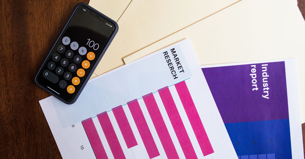
The report lives on detail and context. It was built to be explored: the user applies filters, sorts columns, expands hierarchies, exports a table to continue the analysis. It answers the question "what happened and why" well, because it has room to show how the numbers break down.
What a dashboard is
A dashboard is a consolidated, visual view of the most important indicators, designed to be read at a glance. The goal is not detail, it is the situation: how we stand against the target, what changed since yesterday, where there is a warning sign. It is a car's instrument panel — it shows speed and fuel level, not the engineering of the engine.
A good dashboard fits on one screen, prioritises information and answers "is everything OK?" in seconds. When something is not OK, the dashboard raises the flag; the deep dive comes afterwards, often in a report.
The differences that really matter
Reducing the distinction to "one has more charts" does not help. The useful differences are those that change how you design each piece:
- Purpose: the dashboard monitors; the report investigates and documents.
- Level of detail: the dashboard aggregates to the essential; the report goes down to the detail.
- Reading time: the dashboard is resolved in seconds; the report asks for minutes of exploration.
- Interactivity: in the dashboard it is limited and guided; in the report it is broad (filters, drill, export).
- Cadence: the dashboard is consulted frequently, almost continuously; the report usually has a rhythm (weekly, monthly).
- Audience: the dashboard serves those who decide and need the overview; the report serves those who analyse and need the why.
Note that none of these differences is about technology. They are differences of intent. That intent should guide the design, not the tool you happen to have at hand.
Dashboard and report in Power BI
A brief aside is worth it, because in Power BI both terms have a precise technical meaning that sometimes makes the confusion worse. In Power BI, a report is the file with one or more interactive pages, connected to a data model. A dashboard is an artefact of the Power BI Service: a single canvas where you pin tiles coming from one or several reports.
In other words, in Power BI the dashboard is literally built from pieces of reports. The conceptual distinction still holds — overview versus detail — but it is good to know that, in the tool, "dashboard" is not just a manner of speaking: it is an object with its own rules, available in the cloud version and not in Power BI Desktop.
When to choose a report
Choose the report when the question demands detail and the ability to explore. Signs that you need a report:
- The user will want to filter, cross dimensions and reach the individual record.
- The question is "why" — you need to break a number down into parts.
- The output serves to document (a monthly review, an accounting close, an audit).
- There are many variables and the value is in the analysis, not in the glance.
When to choose a dashboard
Choose the dashboard when the value is in the speed of reading and in monitoring. Signs that you need a dashboard:
- The question is "are we on track?" and needs an immediate answer.
- Several indicators have to be seen together, side by side.
- The consultation is frequent and the audience does not want to explore, it wants to know the state.
- There are clear targets and thresholds that justify visual alerts.
The most common mistakes
When the two concepts blur, the same problems always appear. The first is the overloaded dashboard: twenty visuals, three levels of detail and no hierarchy. It stops answering in seconds and no one uses it. The second is the report disguised as a dashboard: a single pretty page that actually hides the detail the team needs, forcing everyone to ask for exports.
Then there is the mistake of measuring everything. A dashboard is not an inventory of metrics; it is a selection. If everything fits, you are not choosing. And there is the opposite mistake in the report: detail without structure, page after page with no thread to help interpret.
Case study: the same question, two formats
A retail company with around 40 stores wanted "a sales dashboard". On digging deeper, it became clear there were two questions hidden in the same sentence. Commercial management wanted to know, every morning, whether the previous day's sales had beaten the target and which stores were at risk — a glance, a number, a colour. The regional managers wanted to understand why a store was failing: which categories, which margins, which days of the week.
The solution was to separate them. A dashboard with four indicators — sales vs target, year-over-year change, top and bottom 5 stores, stock-outs — began opening the 9 a.m. meeting in under a minute. Behind it, a report with six pages allowed drilling from store to category to product. In three months, the average length of that meeting fell from 35 to 12 minutes and decisions came to rest on the report instead of on guesswork. It was not more technology; it was giving each question the right format.
In practice
Before opening the tool, ask a simple question: what does the person on the other side need to do with this — see the state or investigate the cause? If it is to see, design a dashboard and resist the temptation to fill it. If it is to investigate, build a report and give it structure. Often the right answer is "both", linked: the dashboard shows the signal, the report explains it. Confusing the two is not a vocabulary detail — it is what separates a BI project that informs from one that just decorates screens.