A KPI without context is just a pretty number — a well-designed KPI turns data into decisions.
Why do so many KPIs fail to influence decisions?
The phenomenon is as common as it is dangerous: dashboards full of charts, yet leadership continues to make decisions by intuition or political meetings. The cause is not lack of data; it is a deficit of purpose. KPIs fail when they are not aligned with a clear decision, when their definition is ambiguous, or when they incentivize undesirable behaviours.

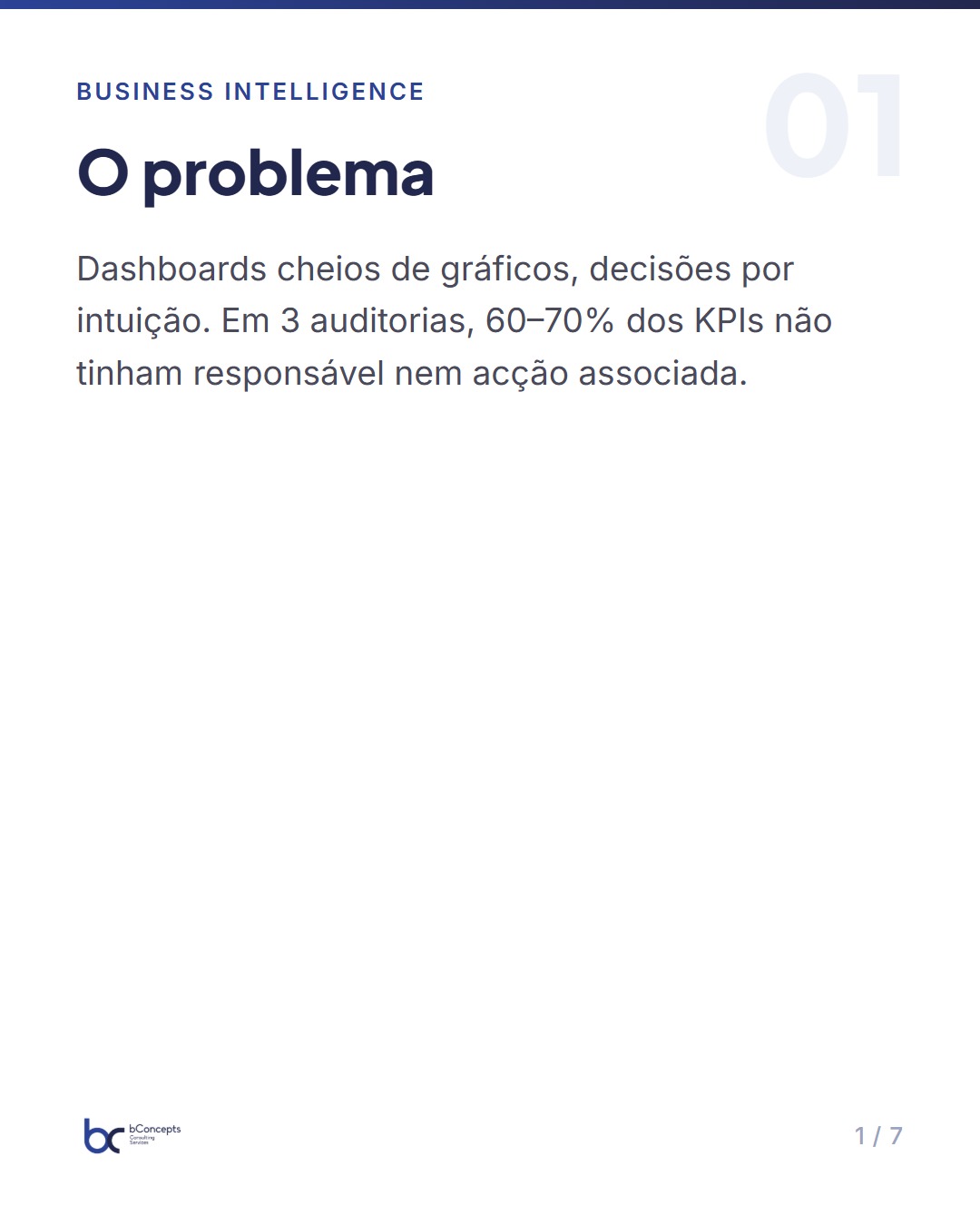
Consider the numbers: in three distinct BI projects we audited, about 60–70% of the indicators on executive dashboards had no identified owner nor an associated action in case of variation. The practical result is predictable: the data produce reports, but we do not produce change. Another recurring pattern is the overvaluation of vanity metrics — visits, downloads, likes — which on average explained less than 10% of the variability of monthly revenue in the companies analysed.
Imagine a KPI that measures only the number of leads generated. If the marketing team is evaluated only by that indicator, it may use low‑cost per‑lead tactics that bring high quantity and low quality. Within a few weeks, pipeline conversion rates fall and salespeople waste time. The KPI was met; the business was not. In a real case we observed, funnel conversion rate fell from 8% to 4% in two months after a campaign that favoured volume over qualification — cost per lead fell 40%, but cost per paying customer rose 55%.
Fundamental principles for KPI design
There are five principles I use as a rule of thumb in every BI project: align, measure what matters, define clearly, instrument for action, and review regularly. Align means starting by asking: which decision do we want to improve? The KPI must link directly to that decision — not be a vague substitute for a feeling of control.
Measuring what matters implies choosing metrics with a plausible correlation to the final outcome (revenue, costs avoided, reduced risk). For example, if the objective is to reduce annual churn from 20% to 15%, choosing metrics such as onboarding success rate (which should rise from 65% to >75%), number of sessions in the first 30 days and average time to first task completion are more useful choices than simply counting logins.
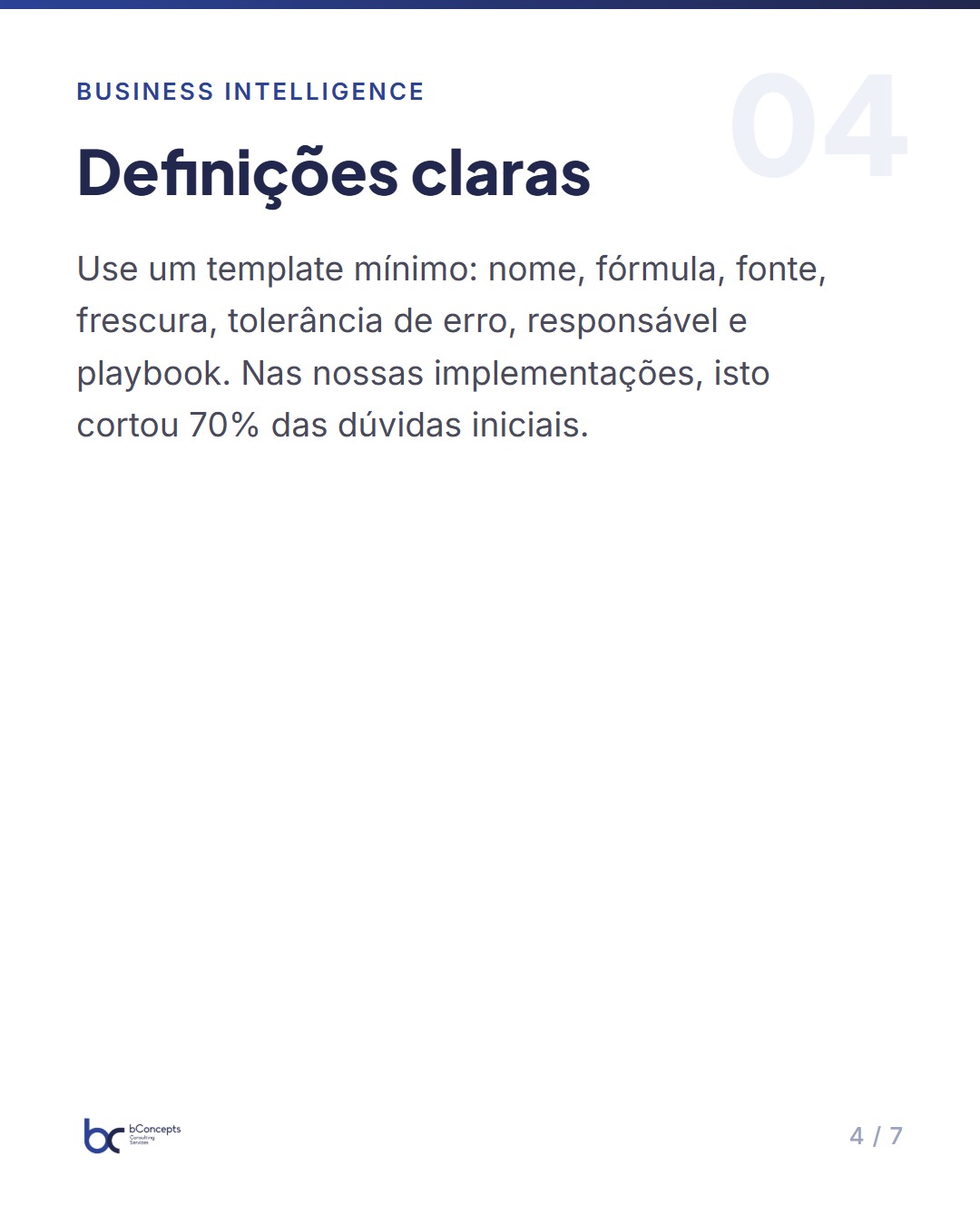
Clear definition avoids ambiguity: what counts as an event? What is the time window? Which filters to apply? Use a minimal template: KPI name; description; mathematical formula; data source; desired freshness; error tolerance; owner; review frequencies; and action playbook. Without this, discussions about "how it was calculated" occupy critical meetings and undermine trust. In our work, a formal definition usually reduces refresh and calculation questions by 70% in the first 8 weeks of panel use.
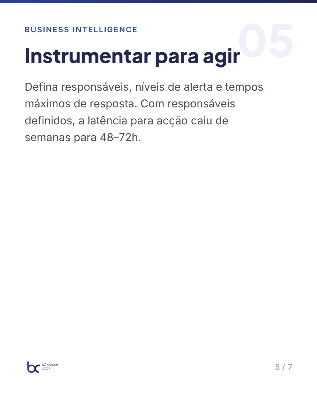
Instrumenting for action requires that the KPI has an owner and a tactical plan when triggered — an alert without a plan is noise. Define alert levels (warning, critical), communication channels (e-mail, Slack, SMS) and a maximum response time (e.g.: 48 hours to analyse a 1–2pp variation; 24 hours for >5pp). Finally, reviewing regularly prevents KPIs from becoming irrelevant as context changes: schedule quarterly reviews with a checklist and update definitions with version control.
Leading vs lagging: how to combine metrics to predict and validate
KPIs can be leading (anticipate outcomes) or lagging (measure outcomes already occurred). Product and operations leaders who only look at lagging discover problems late: lost revenue, high churn. Leading KPIs, such as weekday usage activity, adoption of key features or onboarding success rate, offer early signals for intervention.
Combining both is essential. A robust dashboard typically has 2–3 lagging KPIs that indicate business health and 3–5 leading KPIs that enable preventive action. For example, on a SaaS platform, churn (lagging) should be accompanied by NPS, average session duration and percentage of customers with complete setup (leading). Thus, when average usage falls 15% for two weeks, the team knows to intervene before churn increases.
To illustrate with practical numbers: if the monthly churn rate has historically been 3.5%, a sudden increase to 4.5% is an immediate risk signal. If, simultaneously, the percentage of customers with complete setup decreases from 72% to 62% and average session duration reduces by 18%, that set of leading signals justifies a recovery plan — direct customer contact, review of the onboarding process and an A/B test of support materials. Without leading KPIs, the team would only see the problem when churn already impacts forecasted revenue.
From definition to instrumentation: practices to operationalize KPIs
Defining a KPI is only the first step. Three practical layers follow that ensure usefulness: specification, technical implementation and operational governance. The specification should include name, exact formula, data source, owners, calculation frequency and alert thresholds. This avoids later discussions about "how it was calculated" and enables quick audits if in doubt.
In technical implementation, choose reliable sources and version‑controlled transformations. Set SLAs for pipelines: data freshness < 1 hour for operational metrics, 24 hours for analytical reports; data coverage > 99% and percentage of records with null values < 0.5% for most critical KPIs. Use automated tests that validate invariants (e.g.: monthly sums non‑negative, percentages between 0 and 100) and versioned pipelines in a repository. In projects that improved these practices, we saw an 80% reduction in incidents of incorrect metrics reported to management.
For operational governance, assign a KPI owner with clear responsibilities: monitoring, investigating variations and an action plan. The owner should maintain a playbook with diagnostic steps and key contacts. Without an owner, nobody acts; with an owner, the average latency to action can drop from weeks to 48–72 hours. Rule of thumb: an executive KPI should have no more than two alternate owners defined.
Mini practical case: an e‑commerce SME that reduced costs and increased margin
In an e‑commerce SME with 80 employees, the CFO identified that gross margin oscillated between 28% and 34% across quarters. The BI team proposed a set of KPIs to stabilize margin: average discount rate applied per sale (leading), average logistics cost per order (leading), return rate (leading) and total gross margin (lagging).
Clear definitions were established: average discount = sum of discounts applied / number of orders with discount; return = number of returned orders / orders sold in the same period; logistics cost = total transport and handling cost / number of delivered orders; gross margin = (revenue − cost of goods sold) / revenue. They instrumented pipelines to calculate these KPIs daily and automatic alerts when average discount rose more than 2 percentage points in 7 days. Responsibilities: pricing by product team, logistics by operations, returns by customer care.
In the action plan they implemented concrete measures: review discount policies with per‑customer limits (reducing the number of promotional codes in circulation by 40%), renegotiation of carrier contracts to obtain weight‑band rates and integration of a route optimization engine (average reduction of 8% in cost per delivery on pilot routes). For returns, they improved product descriptions and implemented short how‑to videos, reducing customer returns due to incompatibility.
Concrete results in 6 months: the company reduced average discount from 12% to 9% (drop of 3pp), decreased logistics cost per order from €3.50 to €3.10 (reduction of 11%), and cut returns from 6% to 4.5%. Average gross margin rose from 30% to 33.5% — a gain of 3.5pp, which translated into €420k of annualized margin on €12M revenue. Additionally, average time to resolve critical alerts fell from 6 days to 48 hours, because each KPI had an owner with a playbook.
Important: these gains were validated with small controlled tests before full implementation. For example, the change in discount rules was tested with two cohorts of 2,500 customers each; the restrictive‑rules cohort had a marginal churn increase of 0.3pp but a 7% increase in margin per customer, which justified adoption combined with retention initiatives.
Effective KPIs are not aesthetic; they are commitments to an operational truth that leads to measurable actions.
Common pitfalls and how to avoid them
The first pitfall is metric multiplication: more is not better. Bloated dashboards confuse decision making. Limit executive KPIs to 5–7 vital indicators; in operations, allow more granularity, but with context and clear owners. In a recent audit, teams that reduced executive KPIs to 6 priority indicators increased data‑driven decision rate from 27% to 62% in one quarter.
A second pitfall is overreliance on vanity metrics — pageviews, downloads, followers — without linkage to financial or product outcomes. If your average conversion per active user is 0.6%, having 20% more pageviews does not pay off if it does not raise that conversion. Always convert vanity metrics into actionable hypotheses: for example, “if we increase pageviews 20% and conversion rate responds by ≥0.1pp, then investing X€ is worthwhile.” If not, rethink.
Another pitfall is changing definitions over time without historical versioning. If the KPI definition changes, document it and keep adjusted or flagged historical series. In cases where the definition was changed without record, analysts spent weeks reconciling variances that could have been explained in hours. Finally, avoid KPIs that incentivize undesired behaviour: measuring calls handled without quality can reduce call time harmfully. Always combine productivity metrics with quality metrics — for example, average handling time paired with satisfaction score, with cross‑goals.
How to manage change and keep relevance over time
KPIs must evolve with the product and the market. Establish quarterly reviews with stakeholders to validate whether indicators still support the right decisions. Use a review template that includes: relevance for strategic decisions, technical robustness, maintenance cost and evidence of actions taken in the last 3 months. If a KPI did not trigger any action in a quarter, reassess its usefulness.
Use experimentation to validate causality: if reducing discounts impacts net revenue and satisfaction, that supports keeping the KPI; if the relationship is weak, it is a sign to rethink. Define rules for tests: minimum sample size (e.g.: 200 conversions per variant for statistically meaningful effects), minimum period (e.g.: 4 weeks to accommodate seasonality) and stopping criteria. Document decisions made based on KPIs. A simple log of "action taken, hypothesis, outcome" turns a dashboard into a learning tool. This also helps avoid the temptation to retroactively adjust targets to justify past performance.
In summary
- Align each KPI to a clear decision and to an operational owner who knows how to act.
- Combine leading and lagging metrics: leading metrics allow anticipation, lagging metrics validate impact.
- Define formulas, sources and time windows rigorously; instrument with tested pipelines and SLAs.
- Avoid vanity metrics and bloated dashboards — prioritize 5–7 executive KPIs.
- Review and document KPIs regularly to ensure relevance and continuous learning.
Implementing effective KPIs is both technical and cultural. BI engineers, product managers and operations need a common vocabulary and the discipline to keep metrics useful. Technology helps — pipelines, alerts, dashboards — but it does not replace clarity of purpose nor accountability.
Practical next steps: choose today one critical KPI for your product or service, complete a full definition within 48 hours, assign an owner and instrument a daily calculation with simple alerts. Test the hypothesis for a quarter and record the actions and outcomes.
Which KPI did you choose for that test and which decision should it support?