Measuring a data team solely by the number of pipelines delivered is like evaluating a store by the number of cash registers: it ignores what really matters — what comes in and what goes out. In a mature organization, the value of data manifests in faster decisions, automated processes, fewer errors and, ultimately, more revenue or reduced costs. Translating between technical signals and economic impact requires well‑chosen metrics, clear owners and a continuous validation process.
Why measuring data teams is different from measuring traditional teams
Data teams do not deliver a tangible end product every sprint. They deliver assets — models, datasets, reports, AI models — whose value is often realized by other teams, months later, and hard to attribute. This creates two common traps for decision‑makers: (1) confusing productivity with technical output (lines of code, jobs closed); (2) underestimating the hidden costs of maintenance and technical debt in data catalogs and pipelines.

On the other hand, data teams have an important advantage: almost everything is quantifiable. Latencies, cloud costs, number of dataset users, average incident resolution times and, above all, impact on key business indicators — churn, average revenue per user, operational efficiency — are measurable. The difficulty is choosing the right metrics and avoiding the vanity metrics trap.
Measuring a data team requires understanding two dimensions: effort and impact. Effort is what the team consumes internally — hours, infrastructure costs, technical complexity. Impact is the external effect — additional revenue, costs avoided, time saved for consuming teams. A useful indicator is the impact/effort ratio: for each euro the data team consumes, how much direct or indirect value is generated? Decision‑makers do not need abundant metrics; they need reliable metrics that answer concrete questions like “does this project accelerate daily decision‑making?” or “is this technical debt delaying five high‑value initiatives?”.
The essential set of metrics for decision‑makers
Start with a small truthful set. We recommend three categories with practical examples — and initial targets that can be adapted to the organization’s reality:
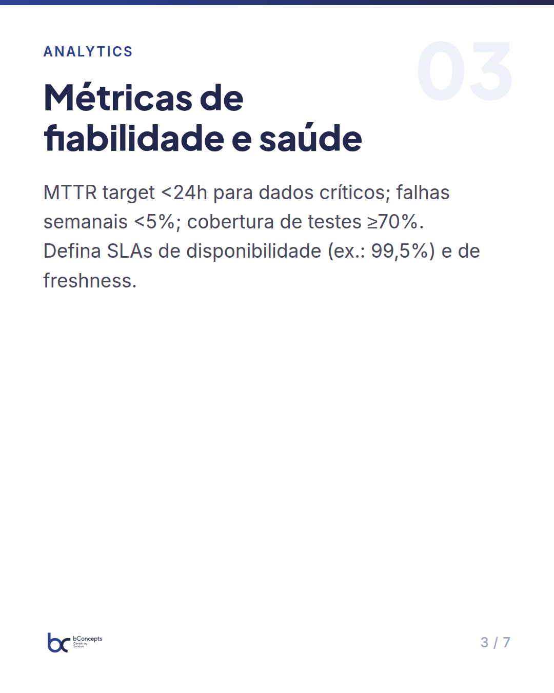
- Reliability and health metrics: mean time to resolve incidents (MTTR) for datasets (initial target: <24h for critical data), percentage of jobs failing weekly (<5% for production pipelines), pipeline test coverage (target: ≥70% coverage on critical transformations). Add data quality SLAs: availability (e.g.: 99.5% monthly), freshness (maximum acceptable data age, e.g.: <2h for streaming, <24h for batch), and acceptable error/duplication rate (<0.1% on critical aggregates).
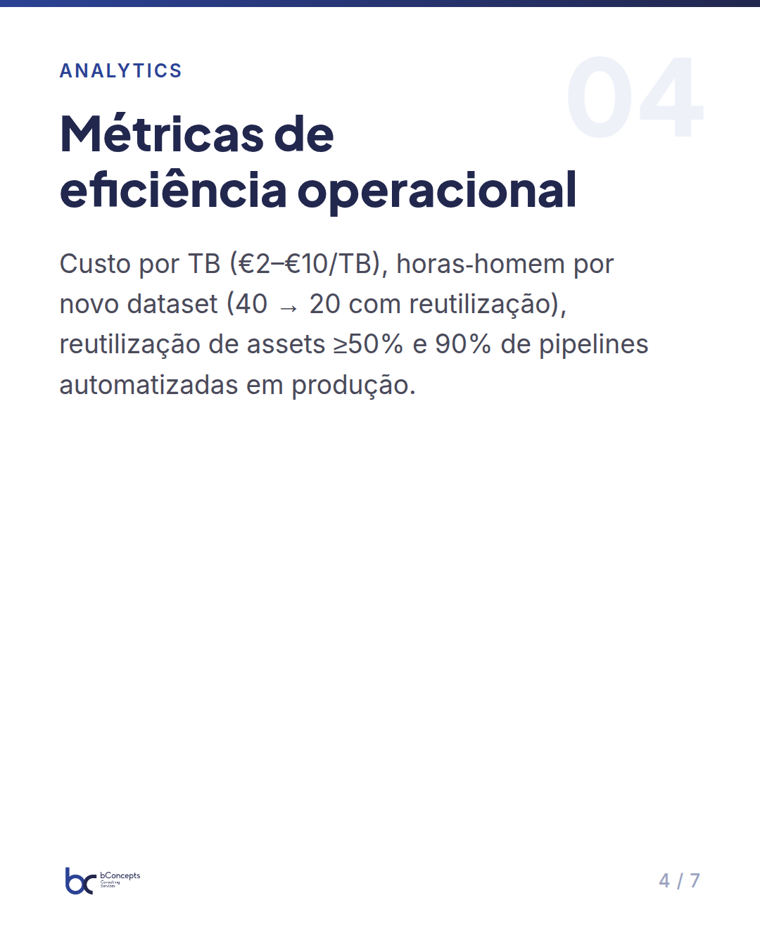
- Operational efficiency metrics: cost per TB processed (e.g.: €2–€10/TB, depending on the stack), person‑hours per delivery of a new dataset (initial target: 40h → reduce to 20h with reuse), asset reuse (percentage of features/datasets reused — goal: ≥50% in 12 months), and percentage of pipelines automated vs manual (goal: 90% in production).
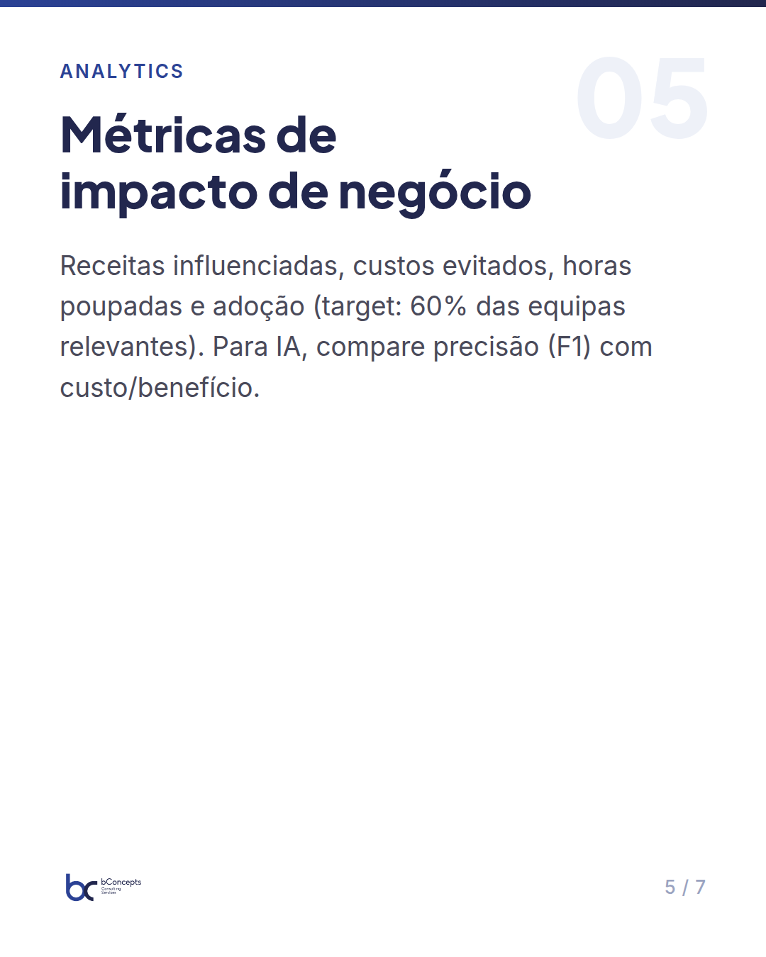
- Business impact metrics: revenues influenced by data‑driven decisions (e.g.: 0.5–2% increase in GMV), reduction in operational costs attributable to automations (euros/year), time saved for consuming teams (hours/month saved), and adoption metrics (number of teams using the data catalog, monthly usage rate — target: 60% of relevant teams use critical datasets). For AI metrics, include accuracy vs cost (e.g.: F1 ≥ 0.8 for fraud models whose avoided cost is ≥€50k/year).
Each metric should have a clear owner (product owner, engineering, analytics), a defined measurement method (tables, observation windows, tags in pipelines) and a realistic target aligned with strategy. Without these three elements, many numbers become noise and create frustration among managers and teams.
Turning technical metrics into business impact
Decision‑makers want to know: “How much return does this generate?” To answer, map concrete journeys and be disciplined in linking technical output to financial outcome. A practical scheme is to map each delivery to a use case and identify a business KPI measurable for that use case.
Practical example: an improvement in a report’s latency from 24h to 1h may seem like just a technical number, but if that latency enables daily pricing decisions that reduce stockouts by 10% in a segment generating €1,200,000/month, the direct impact is recovered sales and improved margin. If the segment’s average contribution margin is 30%, a 10% reduction in stockouts can translate to ≈€36,000/month of margin gain.
To validate causality use robust attribution techniques: A/B testing when possible (for example, enabling the low‑latency report for a subset of stores), before/after comparison windows controlling for seasonal trends, and use of control charts to detect significant shifts. When a controlled trial is not possible, rely on reliable proxies: hours saved producing reports multiplied by the average hourly cost of consuming teams provide a reliable approximation of annual savings. For example, 200 hours/month saved × €40/hour = €96,000/year.
Important: quantify uncertainties. An estimated result of €360,000/year may have a confidence interval: best case €550k, worst case €220k. Communicating that interval to the board avoids unrealistic expectations and demonstrates rigor.
Avoiding traps: the metrics that mislead
Some metrics appear useful but are dangerous if used in isolation. Knowing these traps prevents perverse incentives that impoverish the end product:
- Number of tasks completed — useful for internal management, useless for measuring impact. A task can be “refactor a job” with zero business value if it does not reduce risk or cost.
- Lines of SQL/ETL written — encourages complexity and code proliferation instead of simplification and reuse.
- Average delivery time without context — can disincentivize high‑value research work that takes longer but reduces medium‑term risk.
Another frequent mistake is not measuring data quality with clear SLAs. Without SLAs, the team may deliver faster but with more incidents, which erodes trust and reduces adoption — and adoption is a prerequisite for impact. For example, if 15% of daily reports have errors requiring manual intervention, the correction cost and loss of trust can nullify productivity gains. Define monthly SLAs and internal penalties (re‑work, reprioritization) to maintain quality.
Finally, avoid metrics that create internal competition between teams that should collaborate. Measuring asset reuse by team emulates unwanted behaviors: prefer reuse metrics by product/business rather than by individual team. Incentives aligned with collective impact create better long‑term outcomes.
Mini case study: online retail with 120 employees
In an online retail company with 120 employees, the data team has 8 people (4 engineers, 3 analysts and 1 data scientist). Before the impact‑focused metrics plan, internal indicators were: 40 active pipelines, average MTTR for datasets 72 hours, and 300 hours/month spent by marketing and operations teams compiling manual reports.
The average hourly cost of consuming teams is €35. The direct cost of the data platform (cloud, tools) is €280,000/year; data team salaries ≈ €560,000/year. After defining a set of 7 essential metrics (MTTR, test coverage, cost per TB, dataset reuse, hours saved, revenues influenced, availability SLA), they implemented these actions in 6 months with clear priorities and quarterly deliveries.
Measures and results:
- They automated 70% of manual reports, reducing 300 hours/month to 90 hours/month — savings: 210 hours/month × €35 = €7,350/month (~€88,200/year). This freed two people for higher‑value analytical work.
- They reduced MTTR from 72 to 18 hours through better monitoring, playbooks and rotating on‑call, decreasing critical data downtime by 75%, which reduced operational impact during critical seasonal campaigns (estimated avoided loss: €50k/year).
- They improved asset reuse: from 25% to 55%, reducing average effort per new dataset delivery from 40 hours to 18 hours — a nearly 55% reduction in effort per delivery.
- A personalization initiative based on data increased monthly revenue by 1% on a GMV (gross merchandise value) of €3,000,000/month, generating €30,000/month (€360,000/year). The incremental cost of that initiative was €40,000 in development and €12,000/year in infrastructure.
Combined outcomes in the first year (conservative estimate): savings + additional revenues ≈ €448,200. Considering an incremental investment of €150,000 in observability and automation and €50,000 in training, the ROI in the first year approaches 190% on that incremental investment. Beyond the financial return, there was a compounding effect: with low MTTR and a reusable catalog, new projects took less time to deliver — average time‑to‑market fell from 12 to 7 weeks — accelerating the company’s digital transformation.
Note: these numbers are plausible examples; each organization should calibrate its own assumptions and include confidence intervals for estimates.
Measuring effort without linking it to business consequences is turning data into metrics, not into value.
Practical implementation: a 90‑day roadmap
To avoid the temptation to measure everything, I propose a 90‑day roadmap divided into three simple phases applicable to decision‑makers. Each phase includes concrete deliverables and examples of tools and rituals.
- Days 0–30 — Selection and definition: select 5 metrics (2 health, 1 efficiency, 2 impact). Example: MTTR (owner: data support), hours saved (owner: analytics), cost per TB (owner: engineering), asset reuse (owner: data product owner), revenue influenced (owner: product owner). Define owners, reporting frequencies (weekly/monthly) and data sources (pipeline logs, cloud billing, surveys to consuming teams). Deliverable: a metrics document with definitions and targets.
- Days 31–60 — Instrumentation and baselines: implement dashboards that show metrics in real time (e.g.: Grafana for MTTR, Looker/Power BI for hours saved and revenues influenced, observability tools for costs). Establish historical baselines for each metric using 3–6 months of data and communicate objectives in a leadership meeting. Deliverable: dashboards and a leadership presentation with baselines and targets.
- Days 61–90 — Quick wins and governance: launch 2 quick wins (e.g.: automation of a critical report; incident playbook); establish monthly review by stakeholders and a target‑update process. Introduce a “Metric Owner Review” ritual where the owner of each metric explains variations and corrective actions. Deliverable: 2 quick wins in production, a review process and a quarterly calendar.
The secret is to iterate: review metrics each quarter and remove those that do not guide decisions. Metrics are instruments — they require maintenance and literacy from decision‑makers to be effective.
How to present data metrics to the executive board
Boards want decisions — not complex dashboards. When you bring data metrics, do this:
- Start with impact: three headline numbers — revenue generated, costs avoided and reduction in decision time. For example: “€360k incremental revenue; €88k annual savings in reporting; MTTR reduced from 72h to 18h”.
- Show the trend: present past (baseline), present and target. Highlight realized risks (e.g.: incidents that caused revenue loss) and the mitigation plan.
- Present trade‑offs: increasing delivery speed may increase MTTR; explain the cost (e.g.: reducing MTTR to <12h requires an investment of €80k/year in on‑call and automation). This helps the board decide priorities with full context.
Use an executive one‑pager with 3 numbers, 2 risks and 2 initiatives: that is sufficient for most board meetings and demonstrates control without micromanagement. Always include the owner and the time horizon for each initiative.
In summary
- Combine health, efficiency and impact metrics — each answers distinct and complementary questions.
- Measure business impact with concrete proxies (hours saved, revenues influenced) and assign owners who report regularly.
- Avoid vanity metrics; replace them with indicators that guide decisions and behaviors aligned with strategy.
- Implement a 90‑day cycle: choose, instrument, improve — and repeat. Metrics require governance and continuous review.
- Present to decision‑makers in terms of impact, risks and trade‑offs, not technology; quantify uncertainties and align expectations.
Measuring a data team correctly is an act of translation: turning technical signals into an actionable narrative for the business. Start small, choose metrics that foster adoption and build trust with quick, measurable results.
What are the three metrics that currently drive decisions in your organization — and what concrete result would you like to see next quarter?